The visual language of bitcoin
Since Bitcoin does not have a central authority, there is no specific symbol or style that we can consider official. However, there is a large body of community art and design work, along with a few proposals that ended up being highly influential. Let’s start with some key moments that led us to the visual that many of us associate with Bitcoin today.
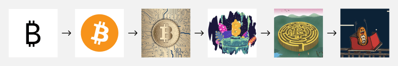
Original symbol
This original icon was a golden coin with bold initial “BC” inscribed, created by Satoshi Nakamoto for the original Bitcoin Core client.
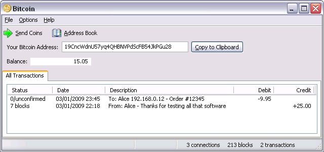
The original logo in an early version of the Bitcoin Core wallet.
Updated symbol
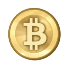
On February 24, 2010, Satoshi posted an updated icon that adopted the capital “B” with two vertical lines (archive.org, bitcointalk.org).
Bitboy
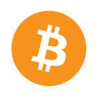
On November 1, 2010, a user named bitboy proposed a new icon and set of promotional graphics on the Bitcointalk forum (archive.org, bitcointalk.org). This iteration embraced a simple, flat style with the hex color #F7931A and a 14-degree rotation.
Promotional graphics created by bitboy.
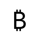
Unicode symbol
The unicode symbol for Bitcoin (₿) was introduced in Unicode 10.0.0 on June 20, 2017. This was an important step for establishing Bitcoin as a currency symbol alongside the US Dollar ($), Euro (€) and others. Few fonts support the symbol as of late 2020.
Beyond the symbol
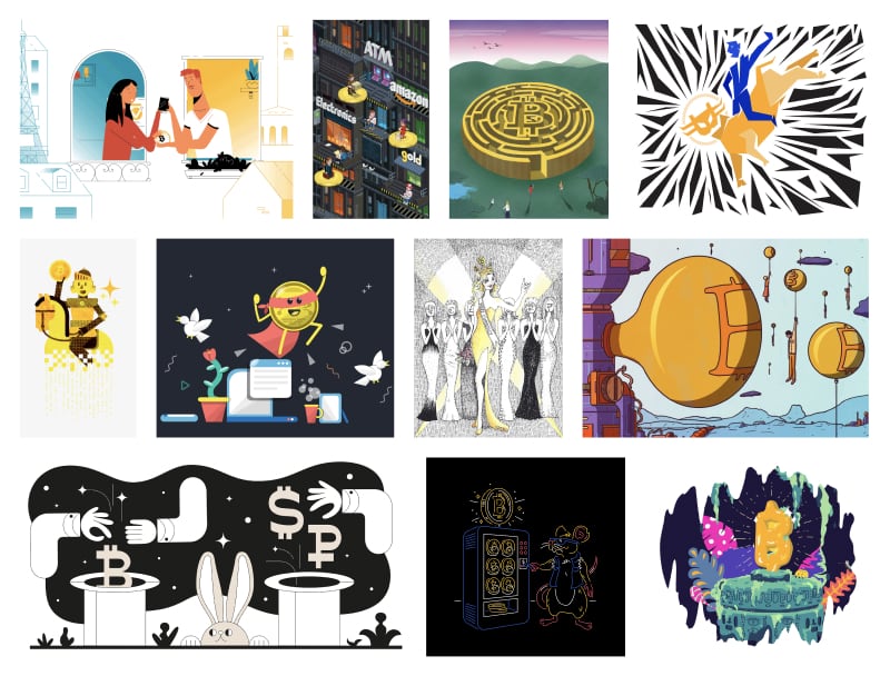
Because Bitcoin is such an open project, there have been endless creative explorations and visualizations. Below are a few categories to provide structure.
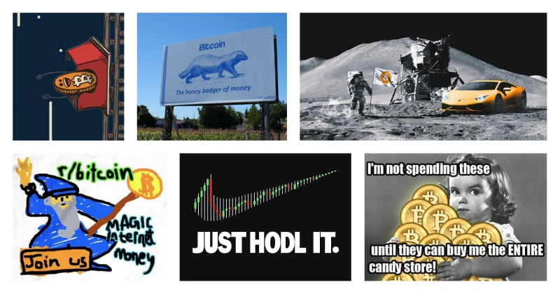
Memes
From moon lambos to the price rollercoaster, memes naturally arise from the sheer infinite conversations of Bitcoiners around the globe. Certain graphics, stories, jokes and ideas stick and spread and become recognizable visuals by the community and are remixed and repeated over and over.
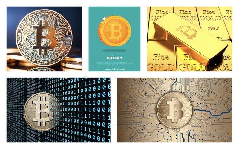
The gold metaphor
Most likely stemming from the original depication as a gold coin, there is a common style of illustration based on this idea. This also builds on the narrative of Bitcoin being a type of digital gold, for which additional elements of binary code or electrical circuits are also often added. On the other end of the spectrum of realism is the depiction of Bitcoin in the style of video game coins, which is more relatable than gold coins to a digital native audience.
Illustrations
Magazines, blogs and other publications often hire professional illustrators to create custom visuals for specific stories. Additionally, companies that integrate or build on Bitcoin also frequently create unique marketing materials. Because Bitcoin does not have any official style, we see many different visual expressions in these illustrations.
The expression scale
A good way to think about the visual language of Bitcoin is of a scale that ranges from minimal to highly expressive. Despite the images below looking and communicating so differently, they can all still be recognized as capturing Bitcoin. One of the great aspects of a public, community-owned identities like the one Bitcoin has, is that all of these expressions are equally legitimate and valid. This provides enormous creative freedom to designers that we should explore and take advantage of.
In digital product design, there are times when a minimally expressive approach is most appropriate. For example, when a user makes a transaction, we want them to be highly focused and not distract them with graphics. At other times, illustrations and stronger visual elements are more appropriate, and this is where we can take advantage of the creative freedom Bitcoin affords.
As you have seen, the expression if bitcoin is shaped by its user base. This brings us to our next topic, which is user-research.